Space · Branding · Content
2019
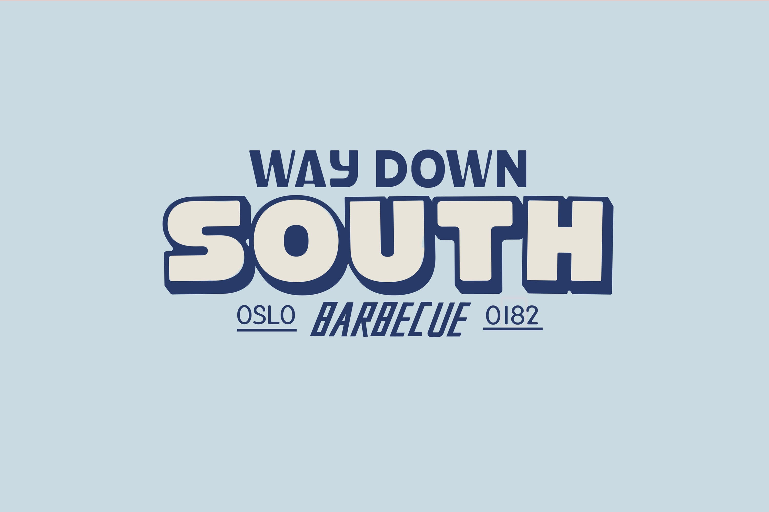
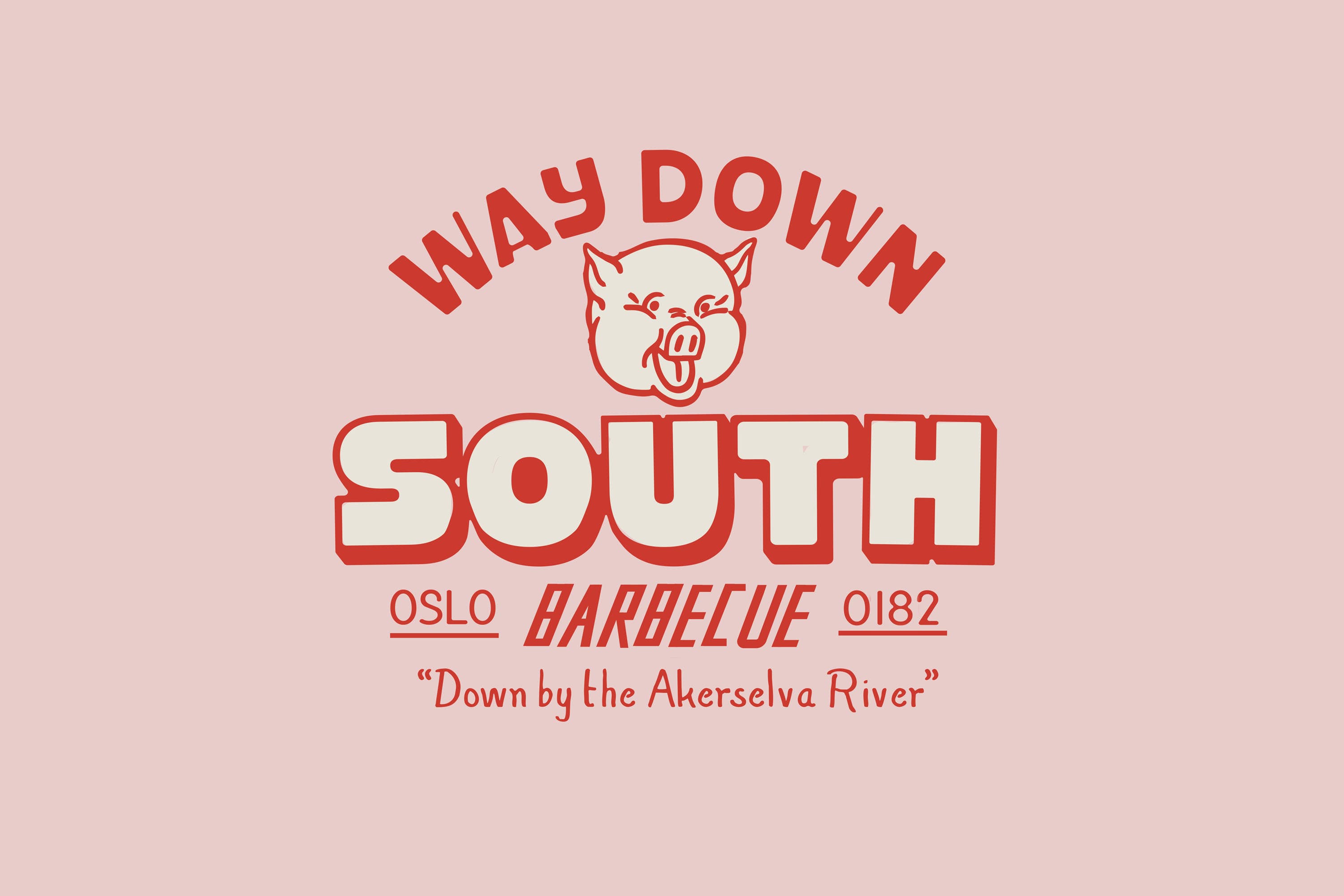
Way Down South 2.0
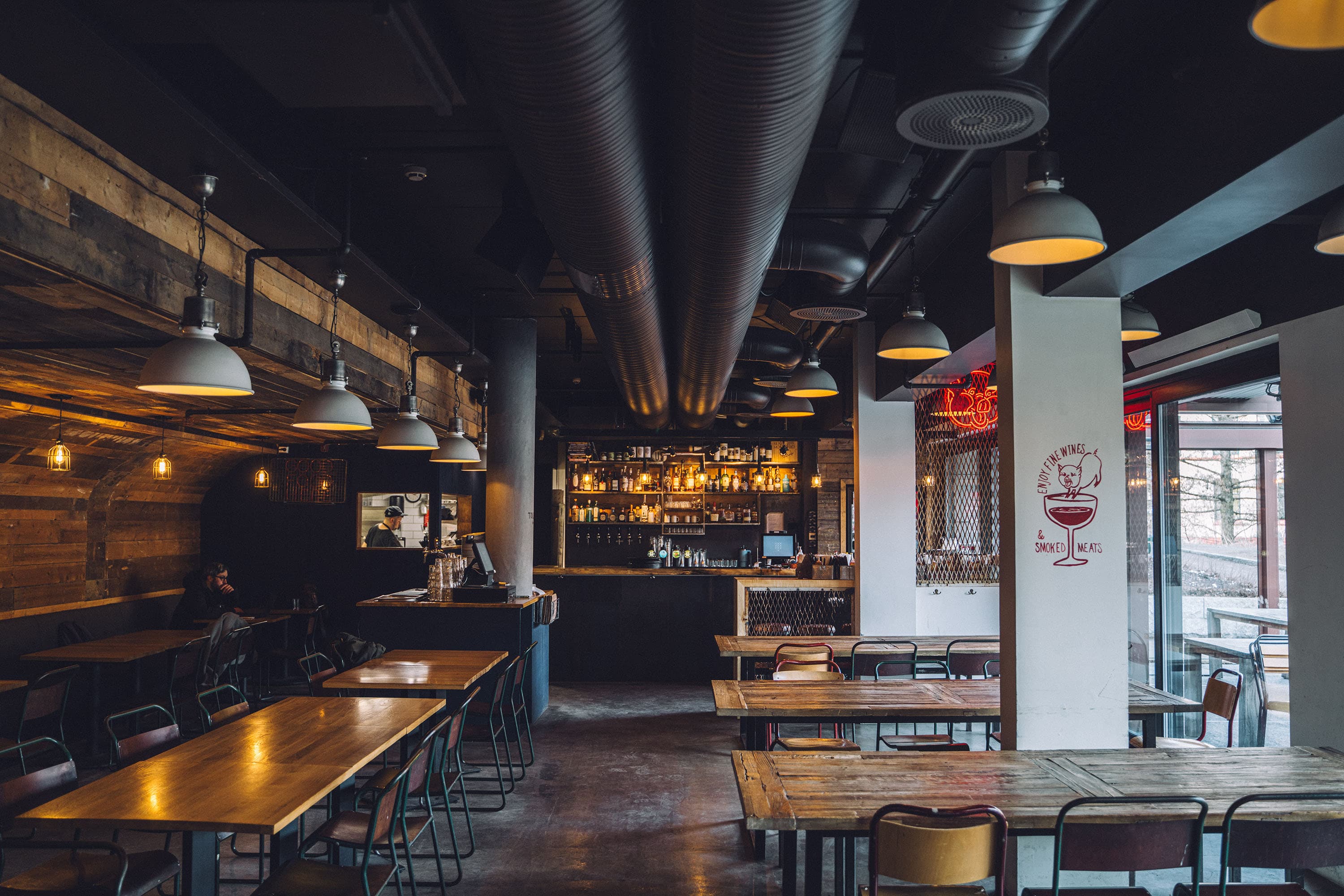
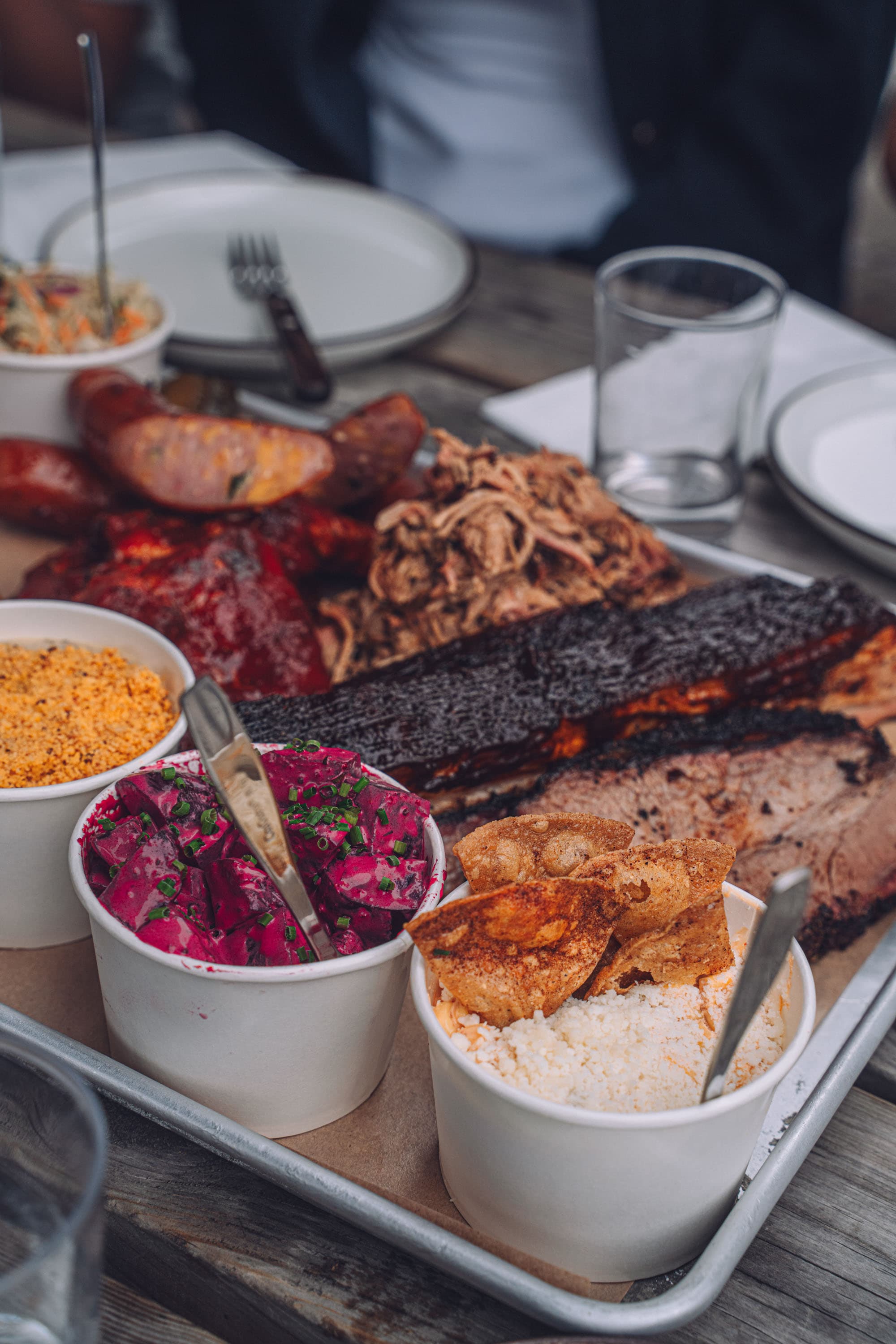
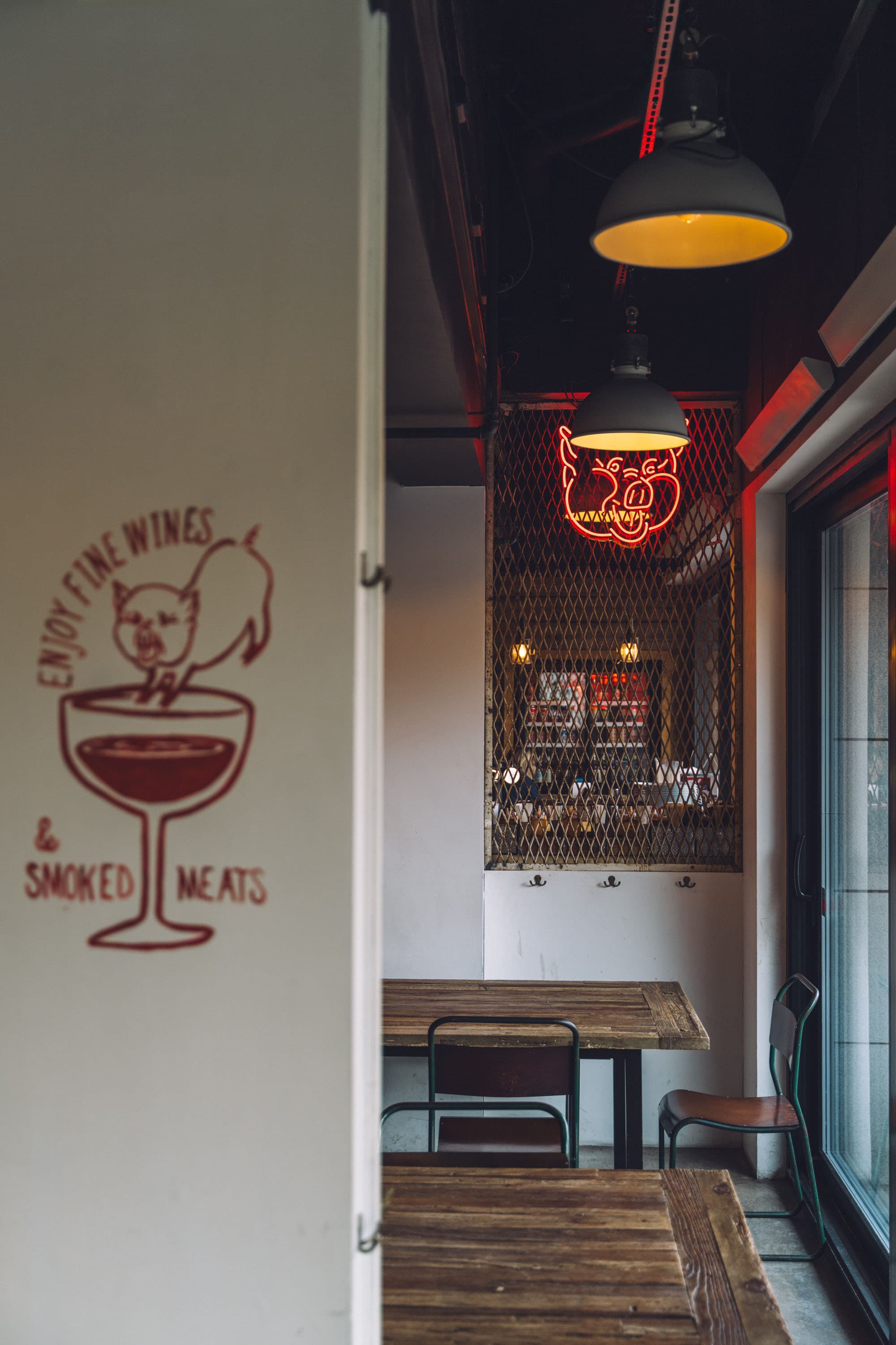
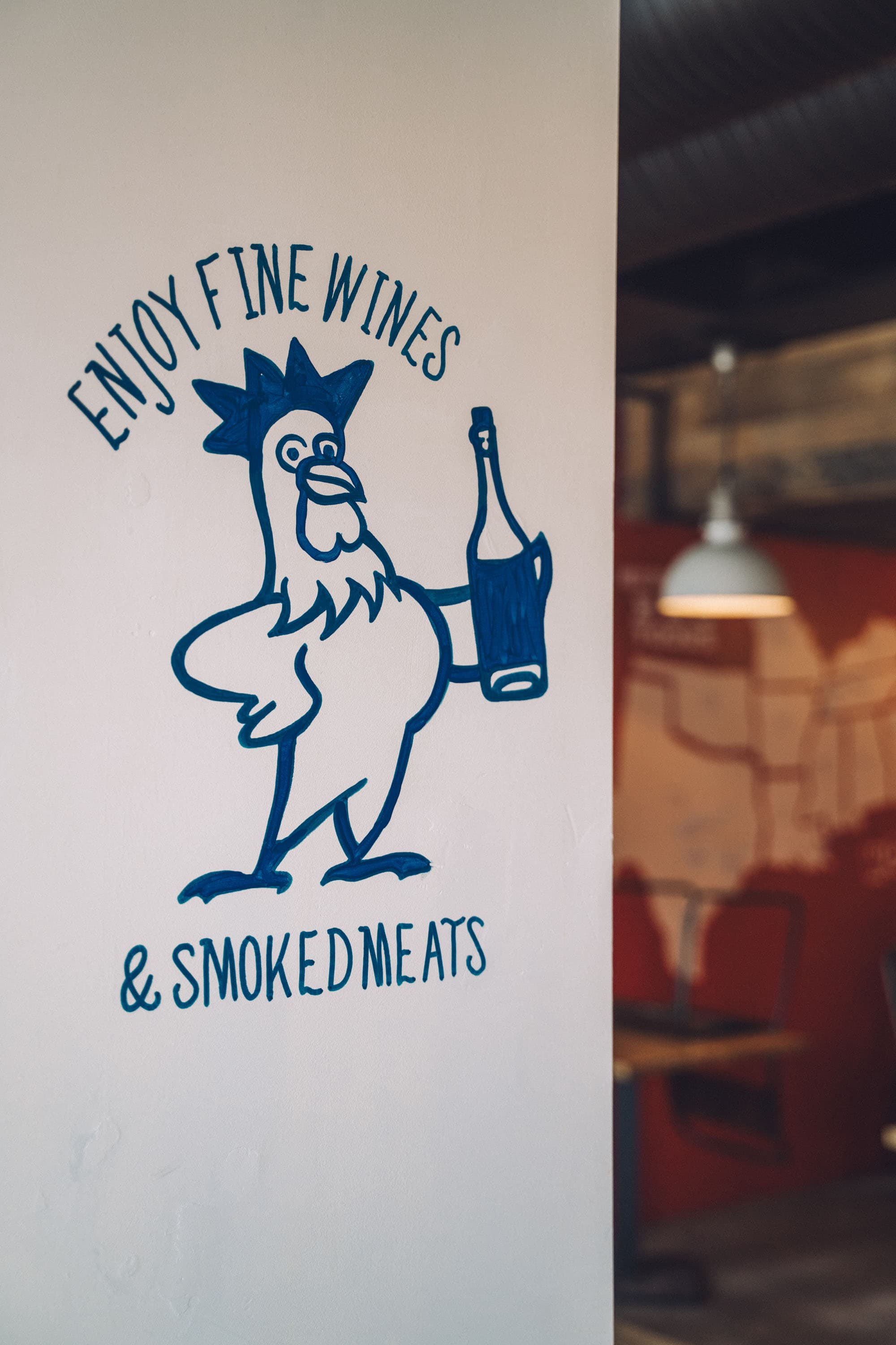
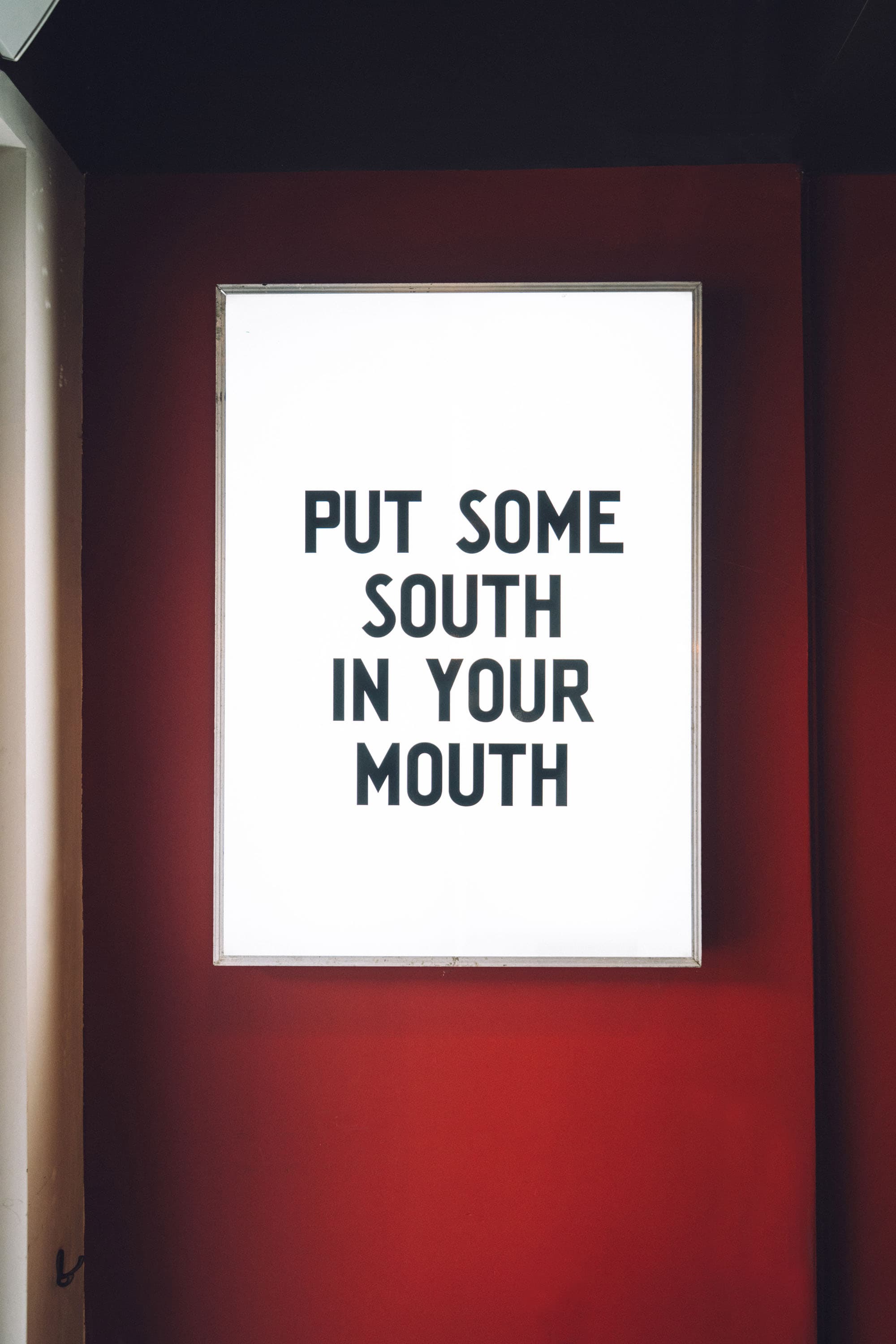
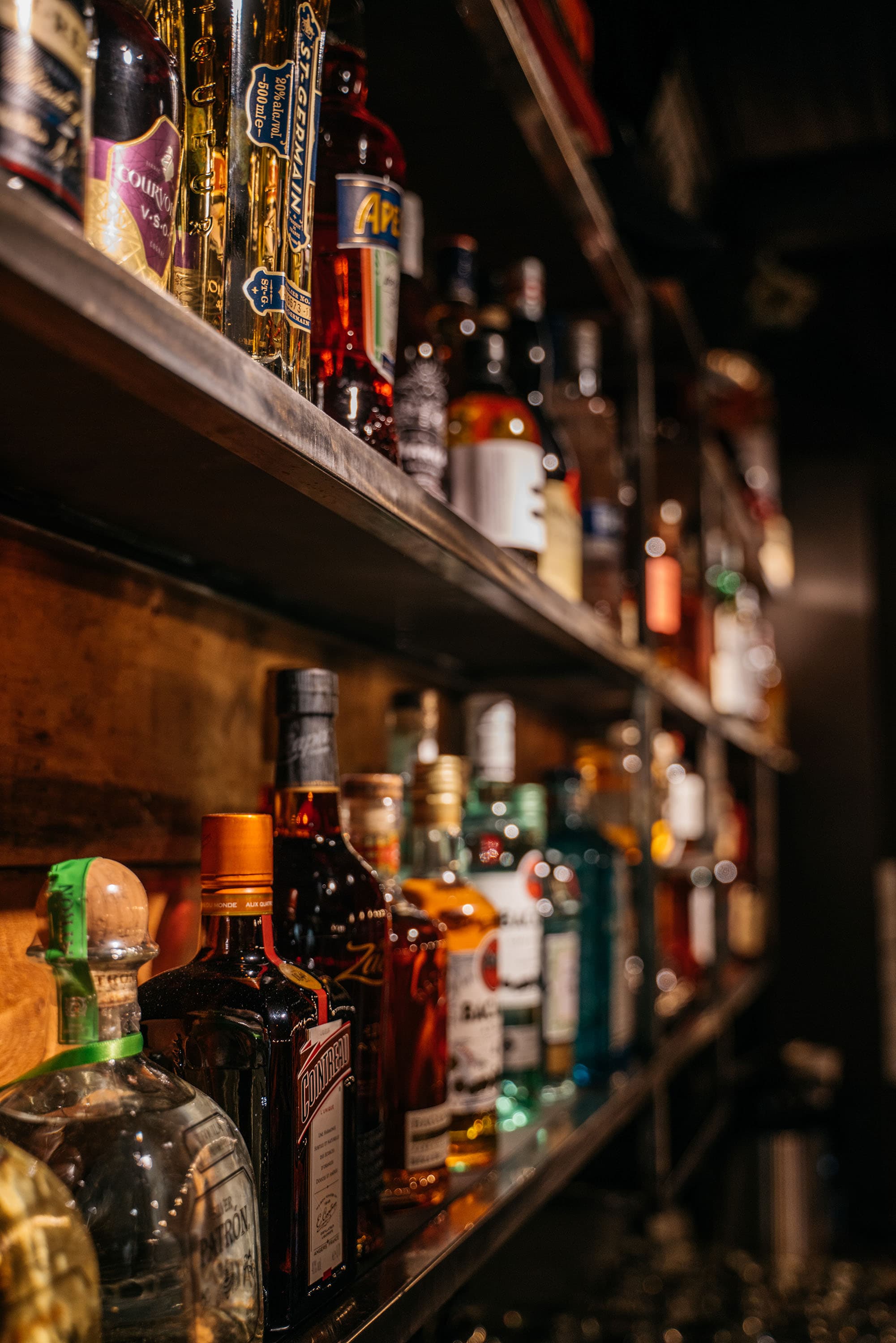
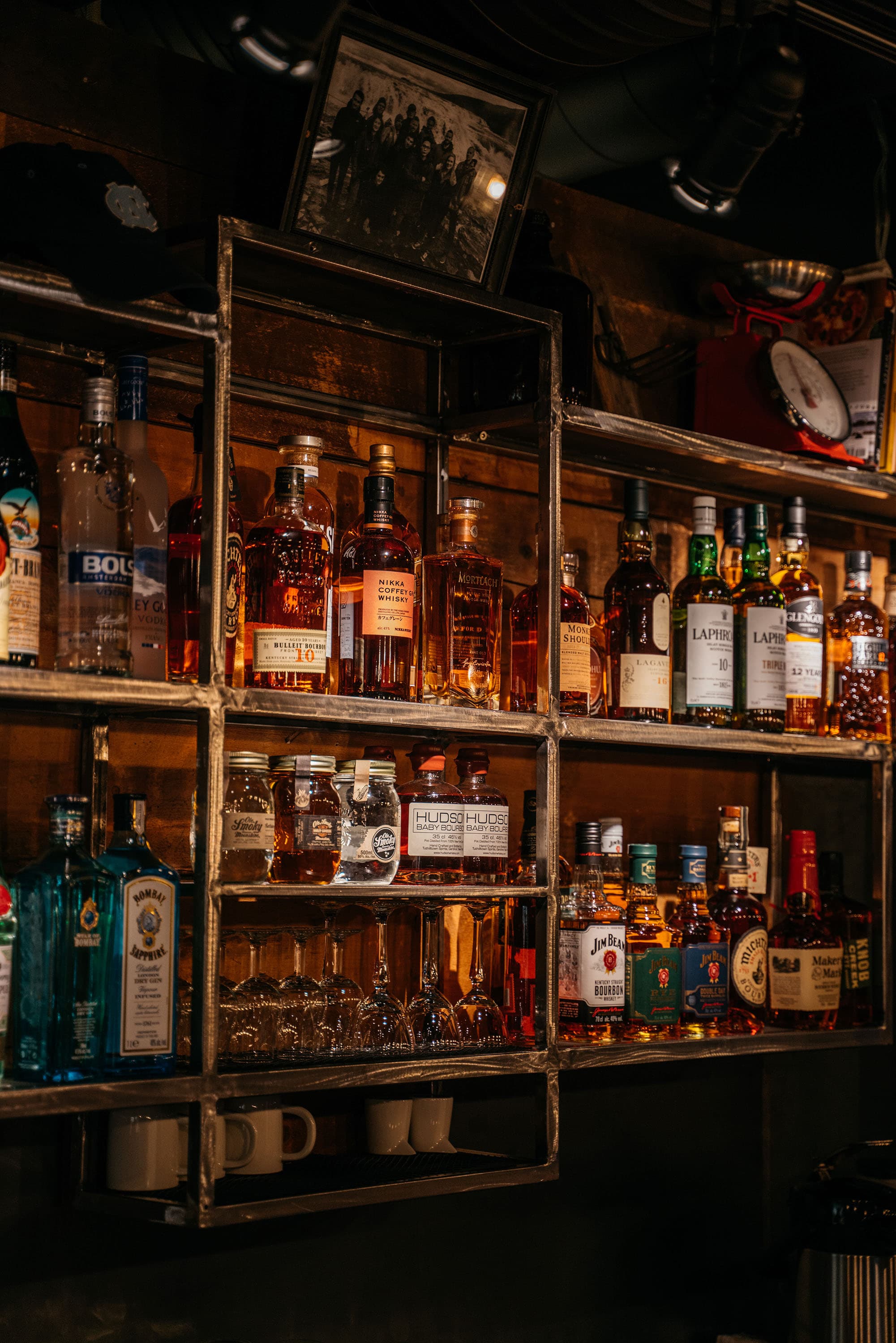
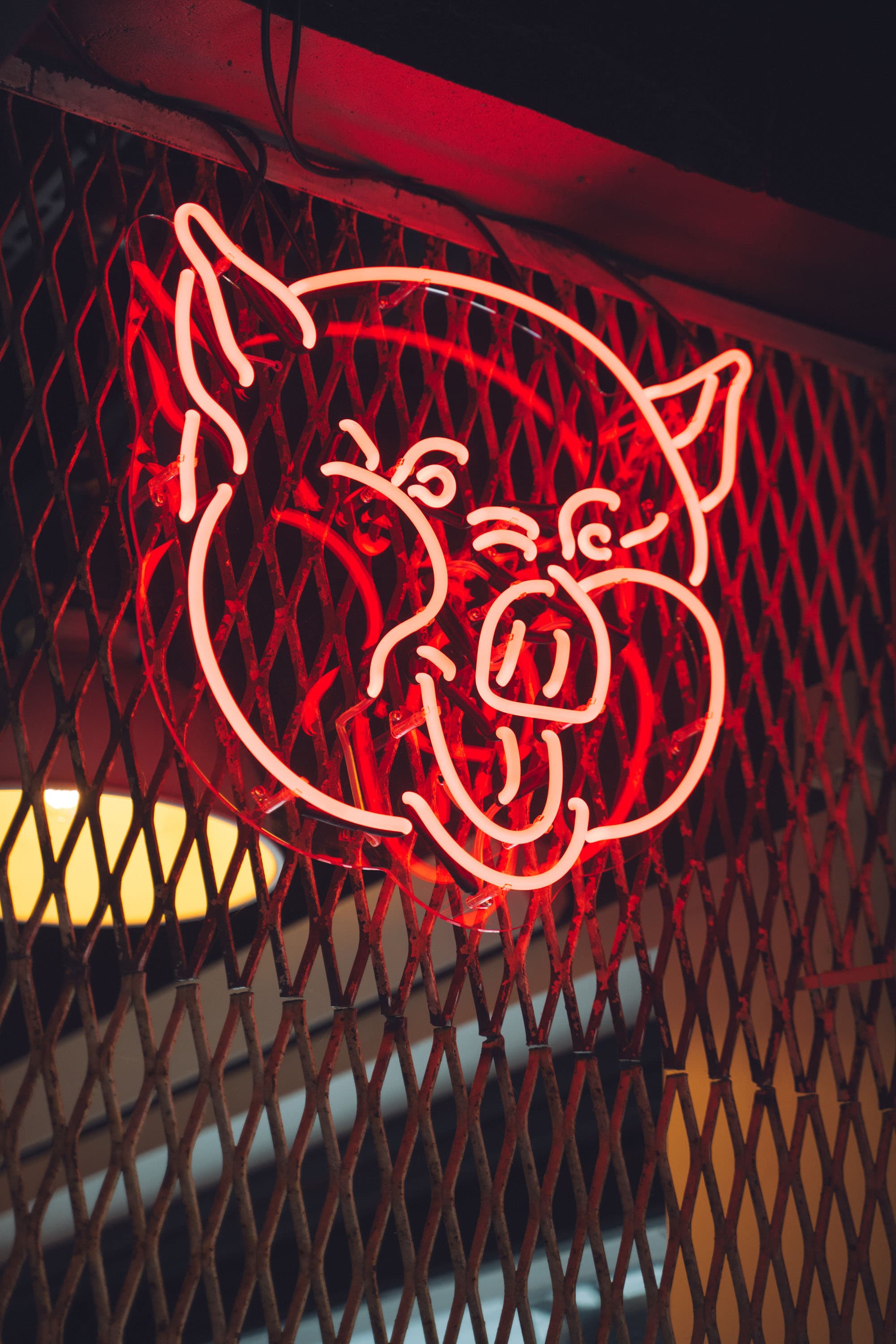
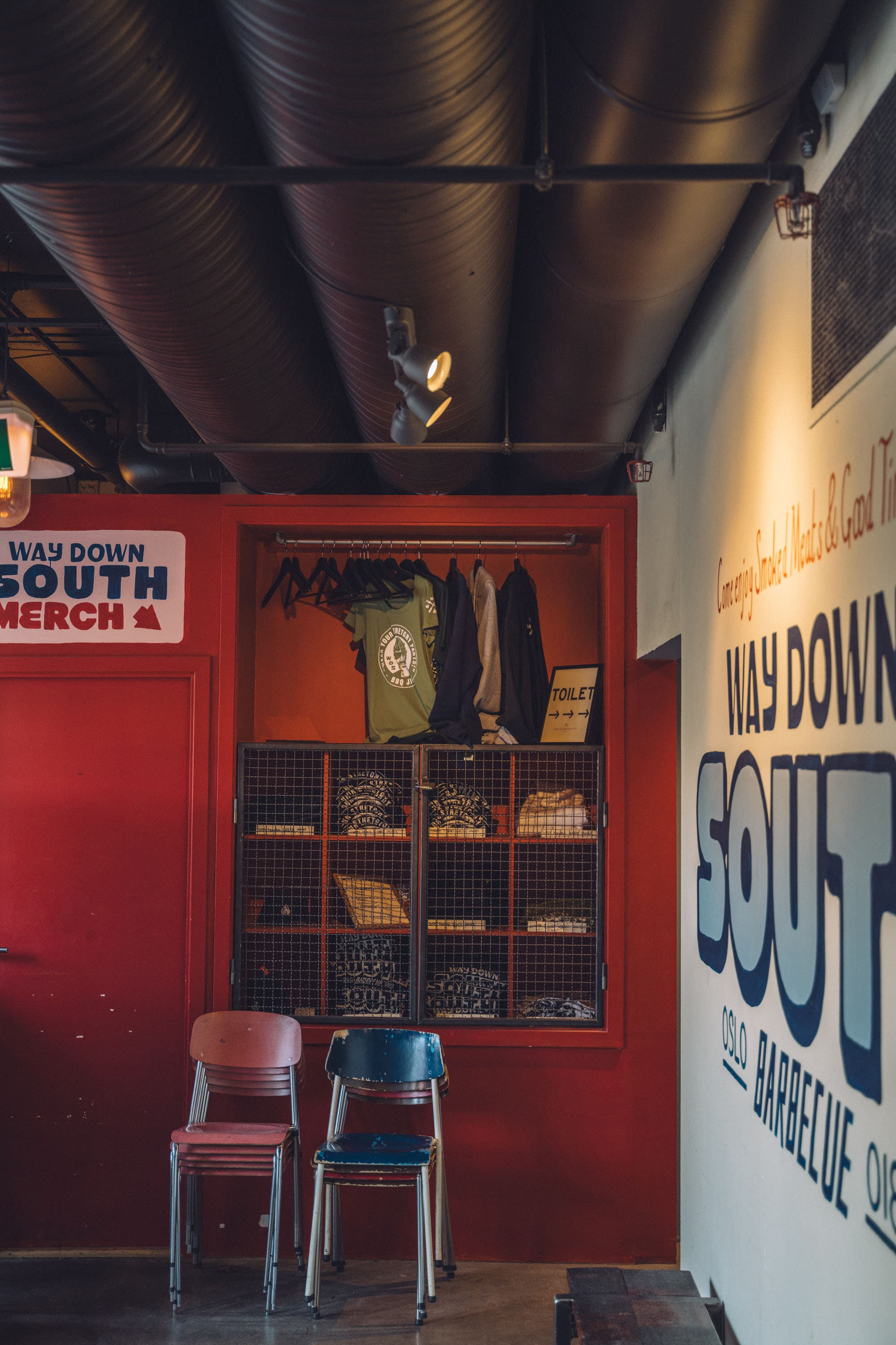
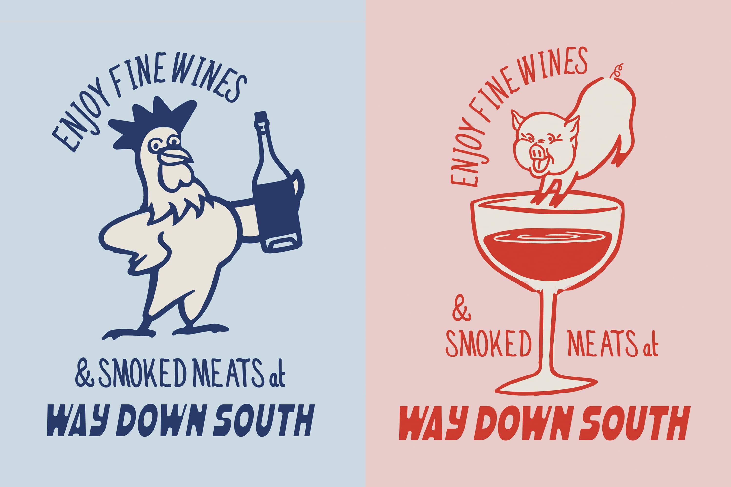
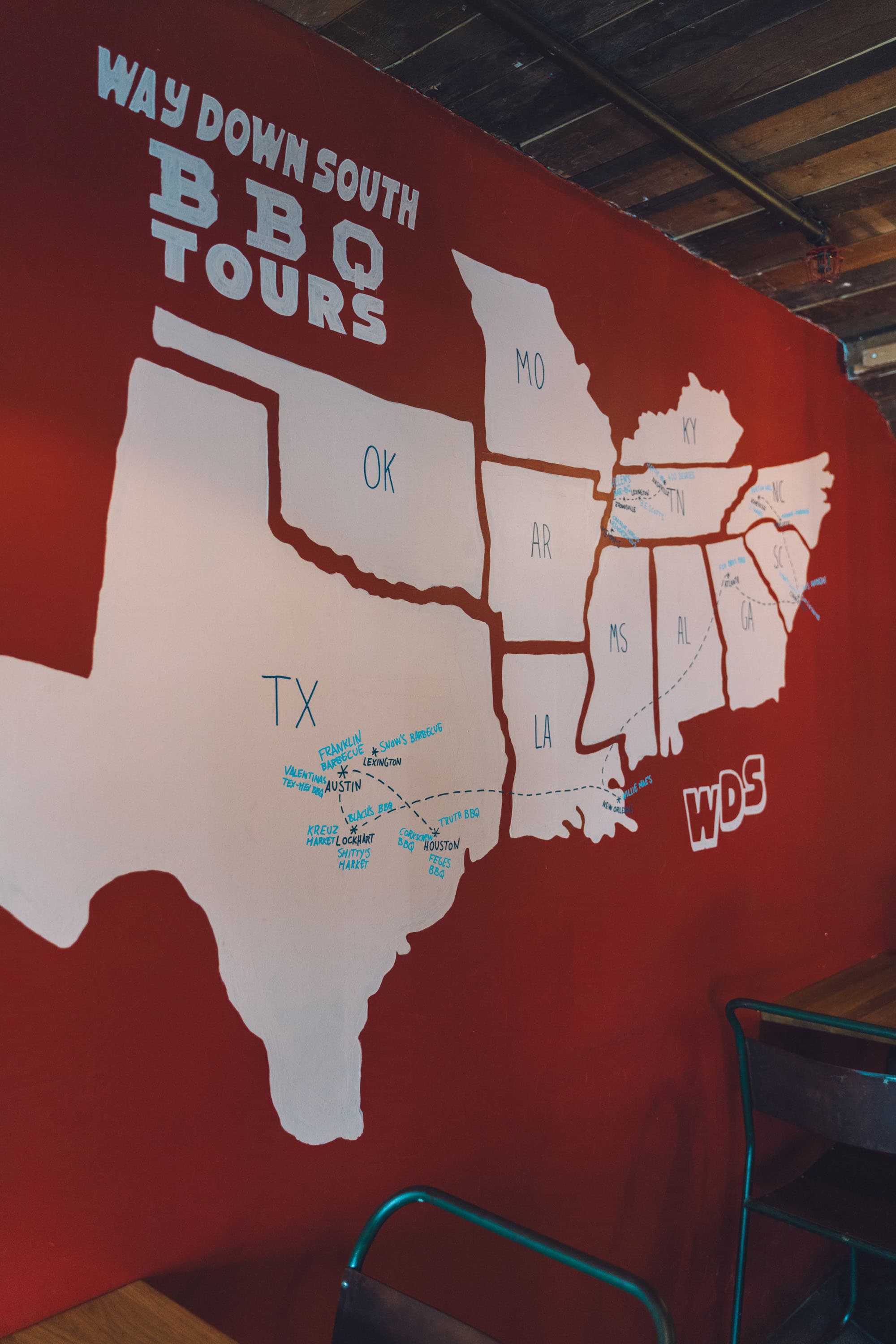
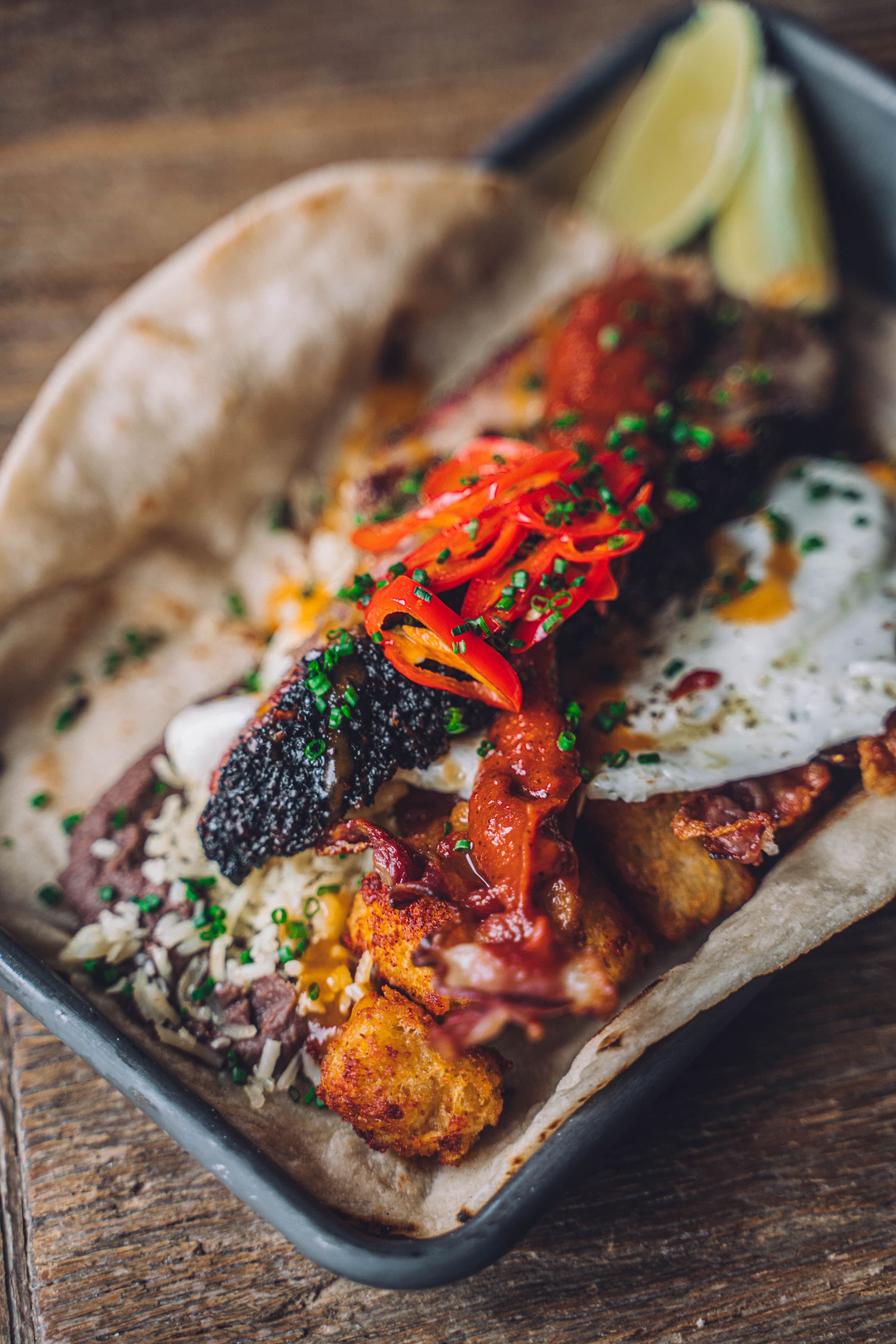
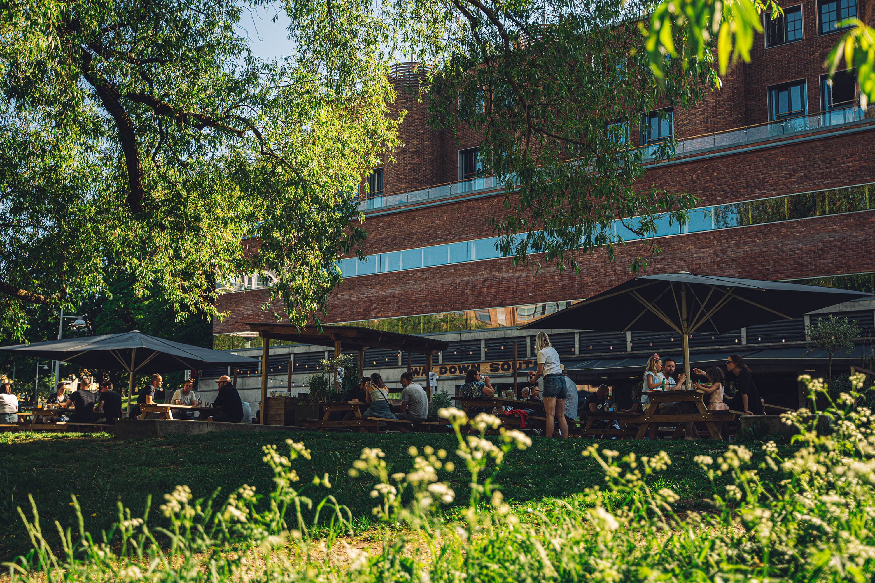
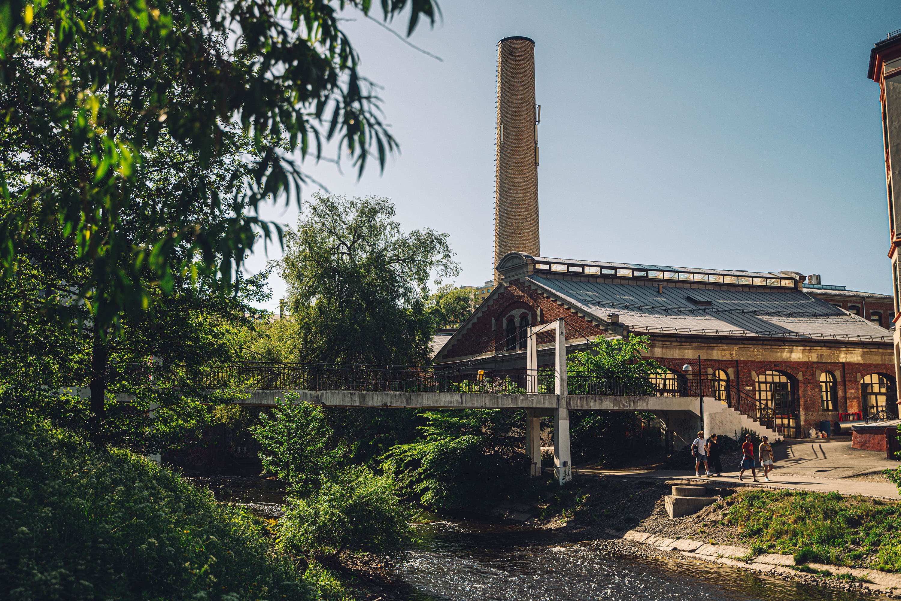
With the second location, Way Down South entered a new phase. A larger space. Higher visibility. Higher expectations. Built around traditional Southern American barbecue and in-house smoked meats, the concept needed an environment and identity that could carry more weight without losing its grit. The project included full interior and exterior design, lighting strategy, signage systems, furniture selection, bar design, and custom neon artwork. The space was developed to feel confident, layered, and unmistakably rooted in Americana without becoming theatrical. Alongside the spatial expansion, a subtle rebrand was introduced. The visual direction shifted toward a more playful and character-driven Americana aesthetic, refining what already existed rather than replacing it. New illustrations were developed, logos were updated, typography was tightened, and legacy elements were reworked into stronger, more deliberate versions of themselves. Photography, marketing materials, and ongoing content creation supported the launch and reinforced the updated identity across every platform. A new range of merchandise extended the brand beyond the restaurant walls. The result was a more assertive and cohesive Way Down South, with stronger presence, clearer visual character, and a space that fully matched the ambition of the concept.
Back to Work